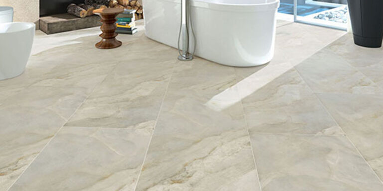
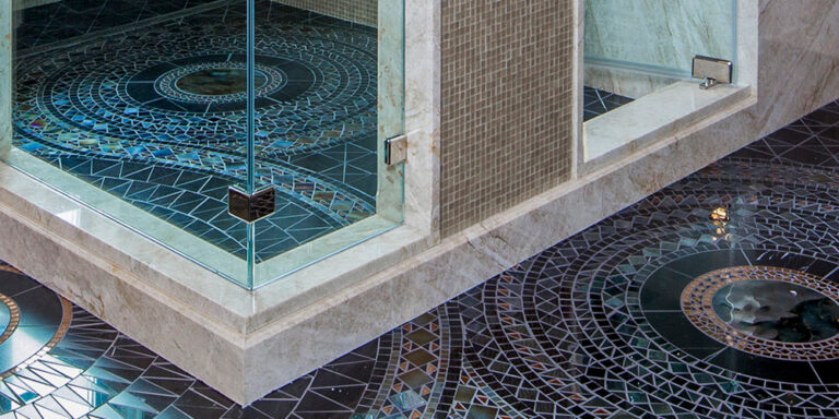
Who doesn’t like a nice kitchen? It’s one of the most important rooms in a property and we love helping people design and create their own luxury kitchen. There’s a lot of different ways to get creative when choosing tiles for your kitchen, like incorporating a feature wall, splashback, or adding mosaics so there’s a lot to consider when you’re planning on renovating it.
Having your kitchen redone can be quite costly when you factor in materials and labour, so it’s important to have a clear picture of what you want before you start purchasing and organising things. As if you change your mind mid-project, it can get extremely costly. So, to help you decide we’ve created this article detailing some tile trends we’ve noticed gaining traction that we think will leave your guests impressed and you overjoyed.
Matt Light Grey Tiles
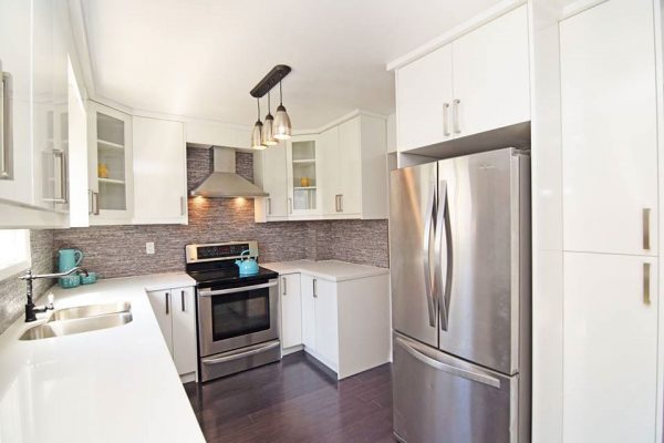
We have always recommended textured grey tiles for a kitchen floor and now we’re noticing quite the large uptrend in textured grey tiles sold. Our reasoning for the recommendation is that as grey is such a neutral colour it’s easy to blend other colours in with it, making it quite the safe choice if you’re re-doing your kitchen. There are very few colours that don’t go with grey, so you can be pretty adventurous when trying to decide. We typically recommend lighter colours with a grey, so that your rooms look brighter and more full as it will add more life to your room. Our Signature Light Grey is a great example of a universal grey tile, it blends perfectly with darker colours like a black matte or charcoal, but then also complements a nice cream or white. Or our Cipriani Gris is another great choice and it’s a cheap tile compared to our Signature Light Grey.
Another great benefit of having Grey tiles in your kitchen is that food can go flying when you’re cooking, but grey is dark enough to hide food and grime stains but light enough to know where to clean when you’re looking up close.
Rule of thumb is that Matt tiles go on the floor, this is because their textured surfaces offer a degree of anti-slip which helps prevents slips or falls that could end up in injury. And as there’s a water splash risk through cooking or cleaning in a kitchen this risk of injury is increased. This is especially the case for bathrooms, as showers can send water flying everywhere and if you’re rushing around to get to work on time it could be recipe for a disaster.
Marble
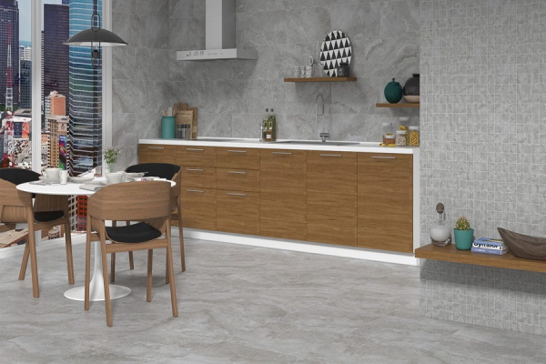
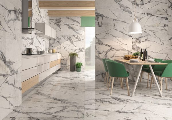
Everyone loves marble, there’s always been huge demand for it and they’re almost always on-trend. It looks nice, goes well with many different other colours, and there’s a lot of different patterns and shades you can chose from. From large strikes to wide splashes there’s a lot you can do with these tiles, but it’s important to not go too wild as if there’s too much colour in the room it can make the design seem overcrowded as there’s so much going on. With that said there’s not many colours that don’t go with white, you could create a nice contrast between light and dark, or you can go all bright with white walls as well (great way of livening up a room).
Beige
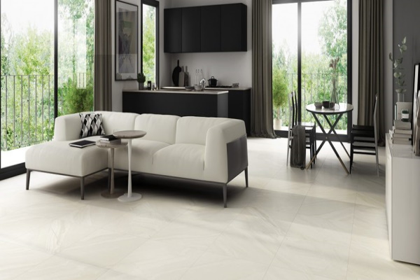
You can’t go wrong with beige it’s another example of a neutral universal colour, you can create some really pleasant rustic vibes with it if you introduce some other darker earthy tones like a brown. Or you can make the room vibrant by adding some lighter and brighter colours like white keeping your design sweet and simple. There aren’t many colours or shades that don’t blend well with beige, it’s main benefit is it’s such a neutral colour. But some generalised interior design advice is to not have too many colours in a room, it can make it seem too busy and cluttered. Our Quina Beige tile, is a great example of beige’s neutrality, it’s not too bright and not too dark allowing to avoid colour clashes.
Patterned Tiles
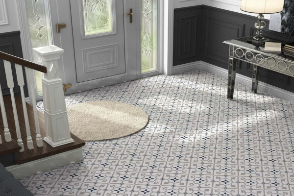
Wanting a stylish kitchen? Then patterned tiles are the way forward for you. With many different patterns to choose from you’re bound to find a design that you love. Thanks to the array of colours that are often in their designs you’re able to use them as foundations for building an aesthetic in your kitchen, basing your wall colours or furniture and fixtures colours around them. And if the colour scheme does get a bit crazy patterned tiles do an amazing job at grounding a colour scheme. Our Durham tile Is a great example of an eye-catching design, or our Brighton tile and it’s blue markings will definitely turn heads while adding a variety of colour.
One last tip from us
Having the same design throughout your property is a trend we’ve definitely seen grow recently, as it creates the illusion that your property is larger than it actually is as the design flows throughout. It’s a great way of making a property seem larger than it actually is, but we wouldn’t recommend it with patterned tiles as the pattern can get really repetitive and be too much.
All of our staff have years of industry experience and are perfectly suited to give design advice, so if you have any questions we’re more than happy to answer them! You can call or visit your nearest Home Tiles store, or alternatively you can call our online department on 0330 912 0434

